“I lack the energy required to deploy the sort of sarcasm of which the idea of using Twitter to explain complex and sensitive departmental policy is so manifestly deserving.”
This view was prevalent among most – though not all – policy officials at the time: Policy is complicated and best left to those who understand it. It is not meant to be consumed by citizens – despite citizens being its recipients and funders.
At the heart of it lies an assumption that the choice between complexity and over-simplification is binary. I disagreed with this view at the time, and I still do. This is precisely where communication shows its value.
In an age of fake news and distrust of experts, those who deal in policy must work harder to engage a wider audience. Here are ten examples which show that complexity can be broken down elegantly.
1) Break it down
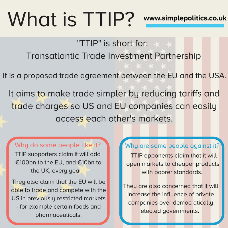
Organisations like Simple Politics or Full Fact are doing great work making political issues, laws and policy comprehensible. This is entry-level. It is purely text-based and requires no budget – just clarity of thought. The following example is a simple explanation of TTIP.
2) Use an everyday analogy
This very simple approach by pharmaceutical company Bristol-Myers Squibb de-mystifies how immuno-oncology works. It uses a few images, short snippets of text, and an analogy that anyone can understand: how to protect your garden from weeds. Click on the image below to read the full story, it’s worth it.
3) Visualise the problem
The following example explains in simple terms what causes traffic, and how to remedy it. It is by a YouTube podcaster, CGP Grey, who excels at breaking down complex issues. By using simple language and basic animations, an issue which is traditionally the domain of transport policy officials can be explained in 5 minutes.
4) Be original in your delivery
This wonderful video by Policyed is based on a poem by Stanford academic Russ Roberts, and explains how the market works. It’s a similar animation-based approach to the previous example, but the whimsical delivery makes it a personal favourite.
5) Give people a reason to share your content
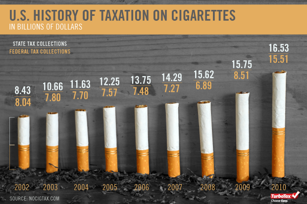
While simple graphs are useful ways of conveying data, will users pay attention? How can you make your data stand out? The following example, from tax preparation software TurboTax, shows that data about tax can be delivered in an engaging, shareable way, with just a little imagination.
6) Don’t lose sight of your overall message
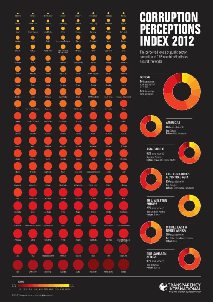
Infographics have been all the rage for the past five years, but as a format they are becoming tired due to lazy execution. The best infographics seek to convey a single, simple message. The following example by Transparency International, won the Kantar Information is Beautiful Award in 2013.
7) Allow users to explore the data
One way of making infographics work harder is to make them interactive. Online tools like Tableau give you the opportunity to put across richer, multi-layered data, and embed them on your website. This example is one of the showcased examples on the Tableau website.
8) Bring the data to life
The late Hans Rosling was a master at data visualisation. In this example, Rosling sets out to explain the link between health and wealth by using data from 200 countries over 200 years. The genius of this example is using neither the X axis or the Y axis for time – instead X = wealth, Y = health, and time is shown through the use of video and an overarching narrative.
9) Mix content formats
This example intersperses a classic video report with graphics, statistics and first-hand accounts which users can interact with. By allowing users to engage with the content, they are no longer passive consumers – they can take a part in the narrative.
10) Make users active participants in the story
First, a disclaimer: this example is one of my projects from when I was digital engagement lead at the Ministry of Justice. However, I think it stands the test of time. This interactive experience sought to educate users about criminal sentencing policy by placing them in the judge’s chair, and allowing them to compare their own sentencing decisions with the sentences which were actually given.
********
What makes each of these case studies exemplary is storytelling. It’s become a cliché – but that doesn’t make it any less true.
Communicating complexity is difficult. We have to work to make it seem simple.
This is a call for policy leaders. Make your ideas work hard, and your content work harder. Don’t take the path of least resistance. A report, a series of tweets and a lazy infographic are not enough.
By not trying to communicate complexity well, we are playing into the hands of populism.


