We looked at five of the leading think tanks from the Think Tank and Civil Society Program (TTSCP) annual Global Go To Think Tank Index Report, to draw inspiration from how they have approached the challenge of mobile access. Here are our favourite features.
1. Navigation: Amnesty International UK
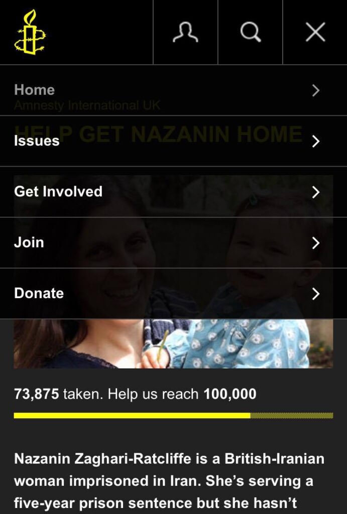
Amnesty International UK is probably one of the best websites to view on a mobile platform. It has clearly been designed with a mobile-first approach – slick, effective and easy to explore.
We particularly like the navigation. It is simple and puts calls to action (CTAs) at its heart: get involved, join, and donate. We’d expect to see a high conversion rate.
2. Events: Chatham House
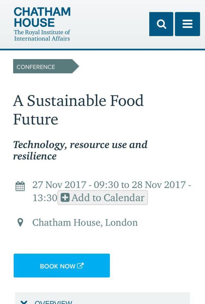
Chatham House was the World’s Best Think Tank according to the recent TTCSP report, and its mobile website certainly backs that view.
The mobile version feels less cluttered than the desktop website, and events are displayed exceptionally well. Users can see who the event is available to – members, conference, partners, and so on – the date, and who is speaking.
The information takes up 1/3 of the screen, and there are clear calls to action – users can book, and add the event to their calendar (Outlook, iCalendar, Google, Yahoo) in three simple taps.
3. Time indicator: Heritage Foundation
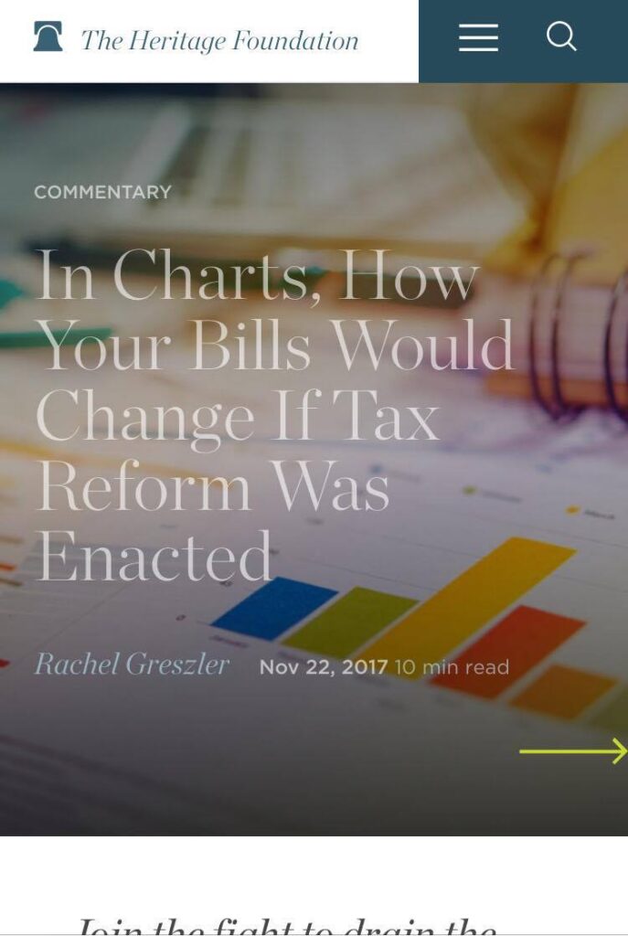
The Heritage Foundation are no strangers to digital content, and do it very well. Of note, their articles include a time indicator giving users an estimate on how long it may take to read an article.
This is very useful on mobile for long-form content, since users are often viewing it on the go or in the midst of doing other things. This gives them an opportunity to read the article there and then, or bookmark it for later if they don’t have time. We’d expect fewer users to drop off mid-article as a result.
4. Article CTAs: Center for a New American Security (CNAS)
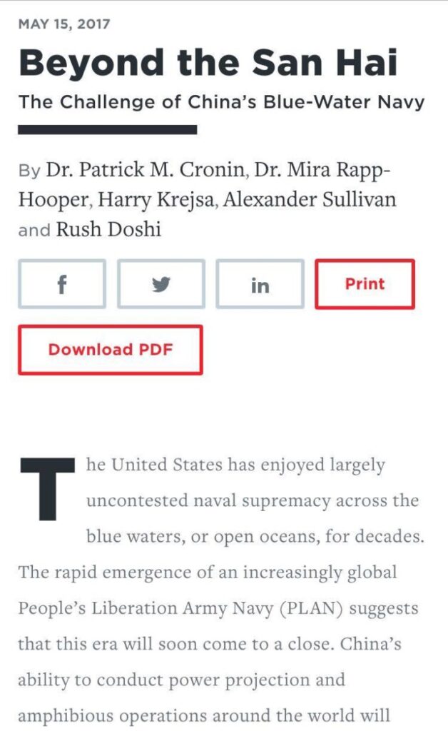
CNAS has a relatively new website, and has thought it through well. One thing we liked was the aesthetic of their articles on mobile, and the ease with which users can take action.
While there is nothing revolutionary in how they display call-to-action (CTA) buttons, we like their prominence and their size, making them easy to tap on a small screen. Users can easily share the articles through social media, print or download to PDF.
5. Search bar: Brookings Institution
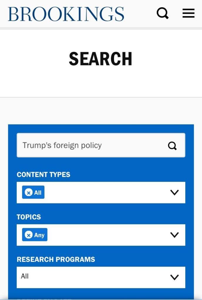
The Brookings Institution is one of the leading think tanks in the US. It conducts research and education across a broad policy range – economies, governance, foreign policy, and global development As a result, it has a lot of content to display.
Compared to their desktop website, the search bar is prominent – but we particularly liked the fact users can apply different filters: content types, topics, research programmes. In addition, searches can be refined by date. This makes content for a think tank as large as Brookings incredibly easy to find.
Didn’t think search bars were that important? Check out our previous work.


