Yet as many adjust their operational processes to be kinder to the environment, very few take into account their digital carbon footprint.
Digital products like websites and mobile apps are big polluters. Because we don’t see them, we forget that these still require infrastructures. And, unfortunately most of the electricity that powers those infrastructures is still generated by fossil fuels.
Currently, the internet produces around 3.7% of global carbon emissions. It is dependent on data centres to stay online and while those centres rely on electricity, only 29% of global electricity generation actually came from renewables in 2020.
As we become ever more dependent on the internet, it’s unlikely that carbon emissions will lower unless we start thinking differently about the digital products we create.
It’s unlikely that carbon emissions will lower unless we start thinking differently about the digital products we create.
At Cast From Clay, we’ve been taking time to understand how to make the websites we build and host for our clients greener. We’ve started by hosting our client’s websites with companies that work to reduce their environmental impact. And we want to create digital products that are better for the planet and everyone in it.
As with anything in these areas, this isn’t a quick destination. It’s a journey of exploration and creativity.
It starts with awareness
One of the main points for both sustainable and greener websites is being aware of what we present in any given page.
Imagine some of your favourite websites.
Most likely, they are full of beautiful images, exciting animations, snazzy custom fonts and surprising functionality. These are all great assets that help draw attention and trigger emotions. But they are also a big contributor to longer load times.
From a sustainability viewpoint, the more complicated a website is, the more processing power it will need. A large amount of content (many, many, pages and files, for example), makes a site bloated and slow.
Use of colour plays a role here too. Google has done extensive research on how colours impact power usage in different ways. In OLED screens, black uses the least power and white the most. They’ve also noticed that blue uses around 25% more power than green or red. Given how ubiquitous hues of Serious Academic Blue are in research organisations’ brand palettes, this might be a good reason to give the shade the heave-ho.
Being eco, and equitable, means offering choice
As a designer, it could be difficult for me to reconcile with this information. Do I have to design really boring websites to make sure they’re not doing any harm?
Having worked in the past in the education sector and in a sports marketing agency, playing with colours, creating fun animations and using interesting custom fonts have been key to connecting with audiences. So, do I just forget everything I’ve done until now?
What I’ve realised is that it’s not about using boring colours or making everything static. It’s about figuring out new ways to make designs interesting without harming the planet. The best part of design is working with problems and limitations to find elegant solutions.
The best part of design is working with problems and limitations to find elegant solutions.
In fact, the best design is purposeful design. So an important question is: Do we actually need all those images, animations and graphics? Are they serving a purpose?
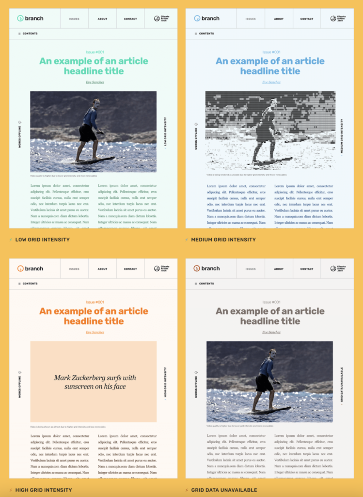
Branch has a smart approach to a sustainable website. They’ve created different ‘states’ for their website, depending on grid demand and availability of renewables. That’s because the grid can’t always supply consistent levels of renewable energy. On a sunny or on a windy day, electricity will be cleaner. When the sun hides or the wind doesn’t blow the grid will pollute more. The site is designed to adjust for that.
Each state has a different look and their logo changes to reflect the state. The site uses system fonts (these exist in everyone’s computers, so there’s no need for extra loading), images are treated in ways that reduce their weight when displayed, and the overall design is created so it doesn’t need much javascript to render.

This is a relatively new experience for web users, so explaining it is important. Doing so will empower your users to think about their impact, creating a carbon-aware web experience. It will also make sure that they don’t leave your page when less is displayed.
These choices give organisations an opportunity to show the ways in which they are ensuring that their values – like sustainability – carry through all aspects of their work.
Resolve to start the journey
Sustainability takes time and evolution. But setting it as a priority is the only way to begin.
As we work to make our websites better, we’re feeling inspired by many wonderful websites and creators that are taking different approaches to what it means to live in a more sustainable future.
Sustainability takes time and evolution. But setting it as a priority is the only way to begin.
The internet doesn’t need to maintain its status as a large polluter. While I’m not a person that tends to make New Year’s resolutions, maybe for 2023 I could make an exception.
We want to help our clients become a little bit greener and reach even more people. Better for the planet, better for the people in it… what better way to start the new year?
Try calculating the carbon footprint of your website.


