This is vital. Our latest report Forging the Think Tank Narrative, found that the majority of politically engaged Americans preferred to have information displayed in short form (infographics and charts) rather than long form (reports and essays).
In an era of distrust in experts, the PDF is dying and those that deal with policy must work harder to engage a wider audience. Here are 10 examples of think tanks doing data visualisation well, allowing their audience to explore the data and bring their research to life.
***
Economics & Finance
1. American Enterprise Institute (AEI)
In partnership with the UCL Energy Institute, the AEI have developed an interactive map of the world’s shipping routes. The user can zoom in on different regions, or use the toggles at the top of the map to explore the ships by type – container ships, dry bulk carriers, oil and fuel tankers, gas carriers, and ships transporting vehicles.
2. Pew Global
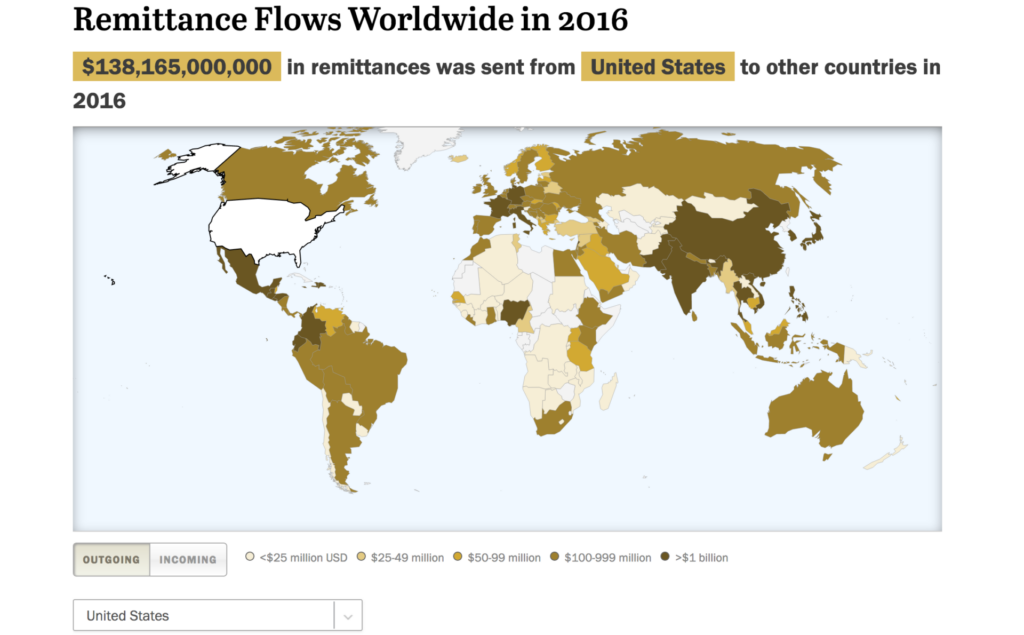
This brilliant map from Pew Global is a smart way to visualise a large numerical data-set. By country, it explores the funds or other assets that migrants send to their home countries in 2016. The user can select either the ‘incoming’ or ‘out-going’ toggle to navigate the data and compare the different remittance flows.
Foreign policy
3. Center for Strategic & International Studies (CSIS)
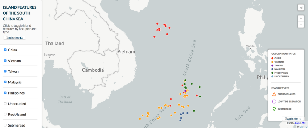
Through using interactive maps, CSIS’ Asia Maritime Transparency Initiative (AMTI) are communicating up-to-date geospatial information on maritime Asia. The below map provides information on the South China Sea’s disputed rocks, reefs, and submerged shoals. We recommend checking the map out for yourself here.
4. Council on Foreign Relations (CfR)
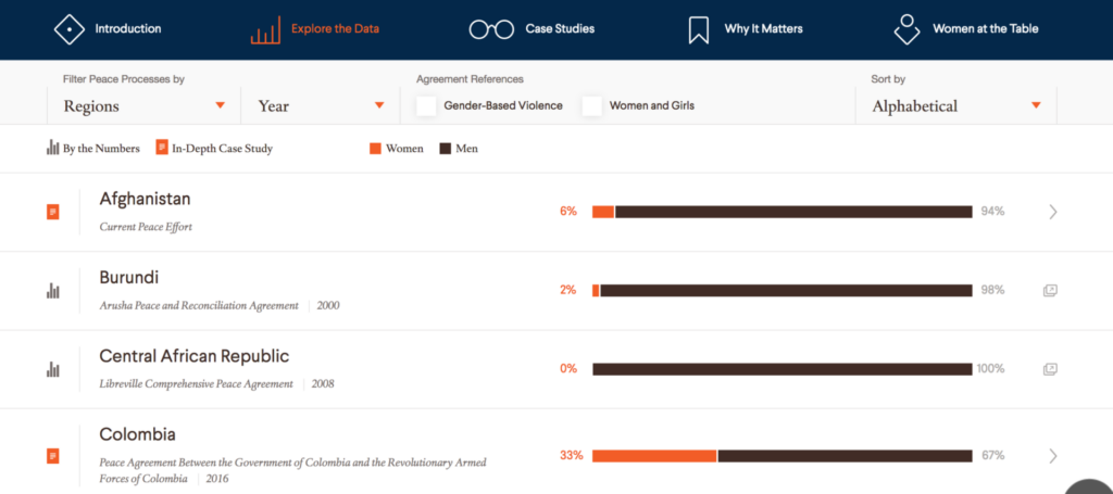
CfR’s Women & Foreign Policy program are doing excellent work visualising both their quantitative and qualitative data on the role of women in major peace processes from 1990 to present. Using their interactive data set, the user can explore numerical data on women involved in peace processes as well as case studies on each country.
Energy & Environment
5. Center for American Progress
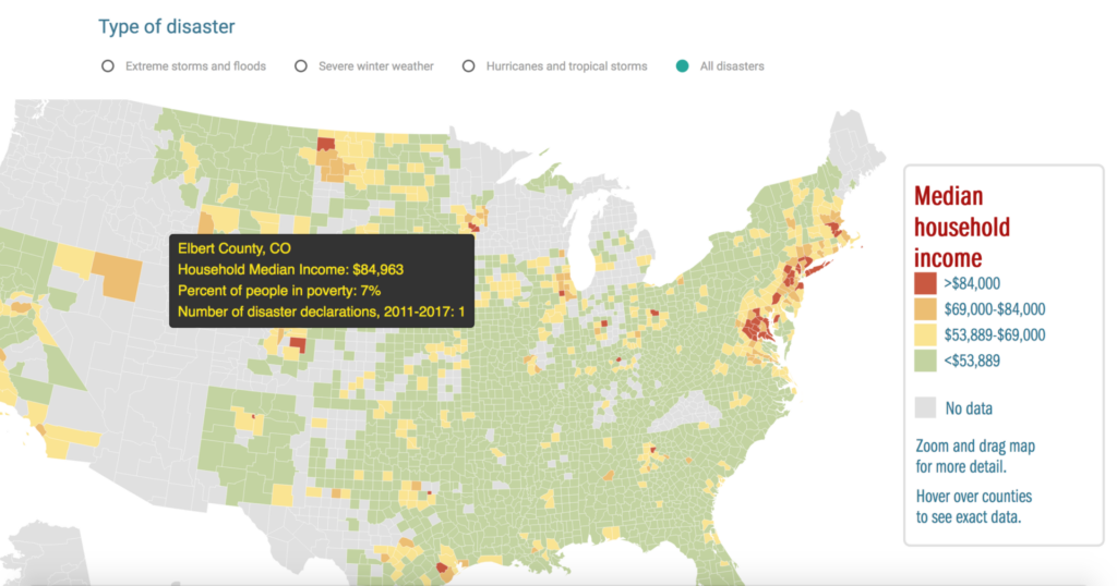
This is a simple but effective interactive by the Center for American Progress. It maps US states who declared an emergency or disaster due to extreme storms and floods; hurricanes and tropical storms; and extreme winter storms from January 2011 through to October 2017. It allows the user to zoom in and hover over counties to investigate the year and type of disaster. Check it out here.
6. World Resources Institute (WRI)
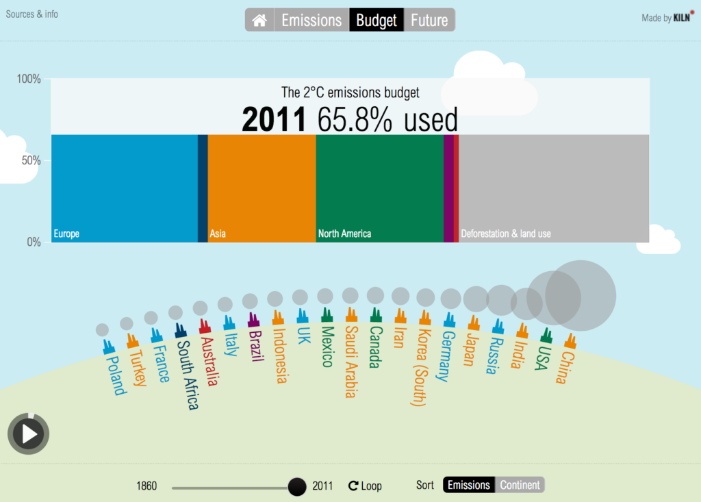
This exciting visualisation by the WRI uses data to tell a compelling story about CO2 emissions. Through exploring the data, the user can see how national CO2 emissions have changed over the last 150 years, how much of the global carbon budget these emissions have used up, and what the future might hold.
National Security
7. RAND
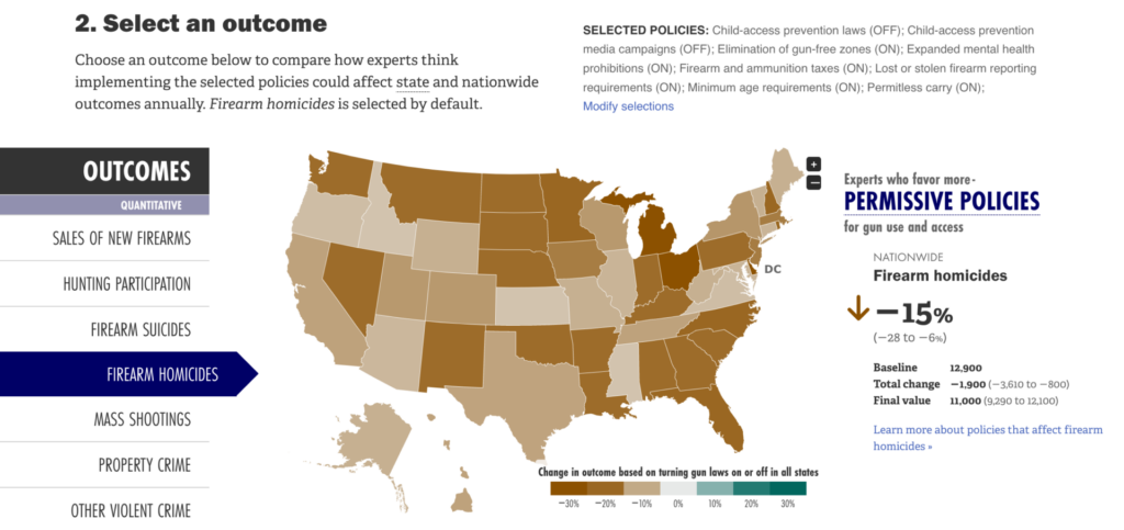
This Gun Policy Comparison Tool designed by RAND is a unique way of communicating complex research findings and data. Through turning different laws ‘on’ and ‘off’, the user can explore the different state and nationwide effects of gun policies as predicted by the experts surveyed in the research.
8. Migration Policy Institute
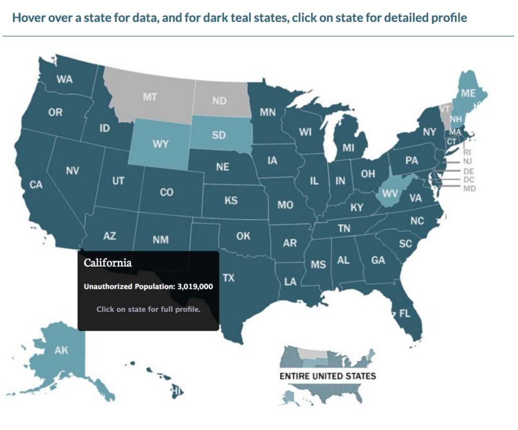
This easy-to-use data tool designed by the Migration Policy Institute tracks the estimated 11 million unauthorized immigrants living in the United States. By interacting with the map, the user can explore countries of origin, dates of arrival, educational and workforce characteristics, English language proficiency, health care coverage, and much more. The data can be explored here.
Health & Global Heath
9. RAND
RAND has appeared twice because they totally get data visualisation. They designed an interesting interactive tool alongside their report on how to better support veterans living in Massachusetts. Through using three visualisations, they have illustrated the resources available to veterans from organisations, census data, and survey data on unmet need.
10. CfR/GAVI
This interactive tool is the perfect example of how to creatively bring data to life. Designed by the CfR in partnership with the GAVI: The Vaccines Alliance, it effectively tells the story of every single routine vaccine introduced by developing countries with GAVI support since the Vaccine Alliance was established in 2000.
The public wants to understand these policy issues – our research shows that 72% of Americans think America needs to understand government policy better. What better way to do that than by allowing users to interact with think tank content in a more engaging fashion.It is not easy to communicate complexity but as the examples above show it is definitely do-able (and here are some other ideas on things you can do too). The era of the 40 page PDF is coming to an end. Now think tank outputs must compete against all the distractions of modern life, capturing the imagination of the users and encouraging the translation of policy ideas into action.


