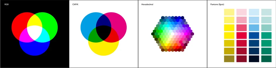
When light is emitted from a source, such as from your computer screen, it is created using additive colour mixing. This is where red, green and blue are added together in different quantities to create different colours. It is referred to as RGB. When they are added together in equal quantities they create white.
The opposite is subtractive colour mixing. This colour type is used when light is reflected from, for example, a poster. It is referred to as CMYK. When cyan, magenta and yellow are added together in equal quantities they create black. A ‘true black’ pigment is added to the process to reduce the amount of ink needed and add more depth to dark colours.
There are two other processes that you commonly come across that are worth a mention.
Pantone (Spot): These colours are specially made from solid pigments, much like the paint you used on the wall in your living room. The company Pantone creates each colour specifically. In total 1,114 and growing every year.
Hexadecimal: This is a six digit number system that refers to RGB codes and is often used for web design as the digits are easily incorporated into the code of a website.
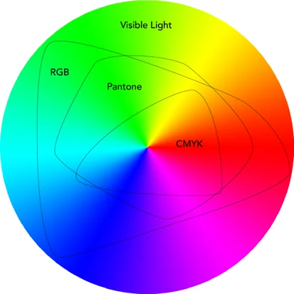
So why all these different ways of representing colour?
Well, additive colour can’t be printed and subtractive can’t really be displayed on screens. Even the best screens in the world at the moment can’t replicate all 7 million colours that we can see in nature and CMYK printing has even less diversity.
The diagram below shows the range or ‘gamut’, to use the fancy word, of each colour system.

If you print it out and hold it against your screen it will almost certainly look different, probably duller. That’s because it doesn’t exist in CMYK so the printer has converted it as best it can.
If the same green was in a PDF it might change again. The PDF that you look at on screen might look different when professionally printed as the screen is interpreting a CMYK document in RGB and might not get the colour right.
It’s hard to show with an example, because by the nature of the subject it’s going to look wrong, but here goes:
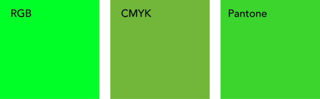
If you open this blog on your phone or on someone else’s screen, you will probably see that the green has changed again. The calibration of each screen is slightly different and what they are showing you is an interpretation of the green HEX code. Pretty much every screen in the world displays colour slightly differently, even the snazzy, super hi-res Macs that designers use.
The colour you see can also be affected by different file types. JPEG, PNG, GIFF are all RGB and designed to be used on screen while PDF, TIFF and EPS are CMYK and set up for printing.
Even professional printers will give you slightly different results from run to run depending on but not limited to: humidity, temperature, raw pigments, ink thickness calibration and operator to name a couple factors.
Right, the acronym limit for this blog post has been reached and we have fallen down the technicolour rabbit hole of colours far enough for now. Suffice to say designers do everything they can to reduce the discrepancies across all platforms, but inevitably not all colours will look the same all the time.
Different colour systems and file types work best for certain tasks and whenever you change from one to another it’s likely a little something will be lost in translation.